Manga Editing
Here are some basic guidelines and pro tips for freelance Manga editors.
The Basics
Get it done.
The most important concept for any aspiring editor is to get the job done. It may not be pretty, it may not be as good as you wanted, or they wanted, but at least it is done. If you can't get the job done, then don't do the job. It is simple as that.
Many new editors fall into this pit, the figure that editing is easy. But then it starts to dawn on them as they are 4 pages in that there are 27 more to go and it is all to much for them. What is worse they fall into it again and again.
Use a proper editor.

Now some people like to challenge themselves by using less than adequate software, hardware, or what have you. But editing is not something that requires artificial difficulty. Therefore, use a good editor. Two good choices are Photoshop and for those (like me) who don't have any money GIMP. Another popular free option these days is Krita.
MS-Paint does not an editor make. Make it a point to get one of these or a similarly capable editor. You will be thankful that you did (down the road).
The Danger of JPEG


JPG images are very useful for their reduced size, especially when transferring images over the internet. However they can be very troublesome for editors. They are lossy, meaning they lose information when encoding. Meaning if you encode an image multiple times in JPG format, you will lose more and more information on each encoding. This is very bad, especially if you are planning to do a High Quality release. Never use JPGs on intermediate steps. Such as passing from scanner to cleaner to editor to typesetter. Only the final release should be JPGs.
Cleaning a new page
Here are a few tips on what to do when you start on a new page. This process is usually called cleaning. It is when you convert the page from a Raw to one ready for more through editing.
Rotation. The first thing you want to do when you get a new raw is rotate it so that the page is more or less straight. THIS STEP IS VERY IMPORTANT. Because if it is not done first, it becomes very difficult to do later on. A ruler or some kind of on screen guide, ruler, or grid can be very helpful during this process.
Cropping. Next you want to crop the image. Most raws are very large and have an excess of extra image unrelated to the page you are going to edit. These need to be cut away. Sometimes despite your best efforts the pages will not be entirely straight. One side may be slanted while the other is not. This is strange, but it happens (fairly often). So jsut do the best job you can. DO NOT OVER CROP, IT IS BETTER TO KEEP SOME JUNK THEN LOSE GOLD.
Level. Proper leveling is an art in and of itself. Leveling makes whites whiter, and blacks blacker. But many editors have a tendency to over level their pages. This is a simple guide to leveling. If your image is black and white, be sure to convert the image to greyscale before leveling.
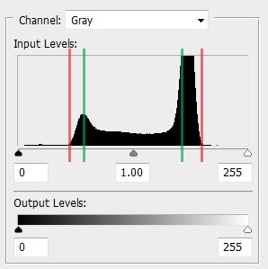
Do always level to these points. Luckily, most programs that have autolevel, take care of this part!
You may level this part! But be careful, if you go to far you will 'overlevel' the image which is as bad as not leveling it at all.
The Pillars of Good Editing
Cleanliness
This is the category which makes or breaks most editors. So it is somewhat longer then the others.
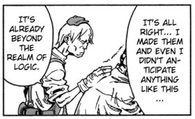
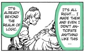
Text Alignment More specifically center text alignment. In all but the rarest of cases, you will want to center align speech bubble text. If you cannot do anything else, do this, it greatly improves the look of any edit.


Give your text room to breathe. You don't start writing your sentences on the exact left side of a piece of paper do you? I certainly don't. You use margins. The same rule applies to speech bubbles and other bordered text. Give it some room and it will look much better. Crowding the edges make the text harder to read, especially at lower resolutions.
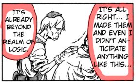
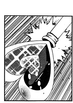
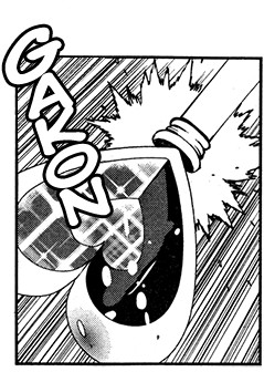
Erase carefully. Large white blocks do not look very good in a panel. It doesn't matter if your whiting out a text box or erasing a sound effect, if you can see the white box, you need to erase it more carefully. You should fit your selections, you do not have to be entirely precise, but the less you erase, the less you have to cover back up.
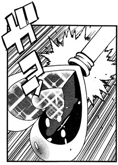
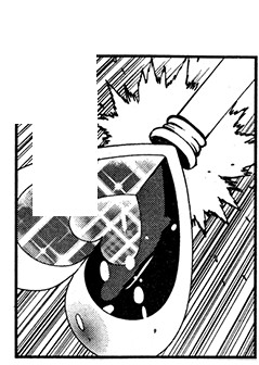
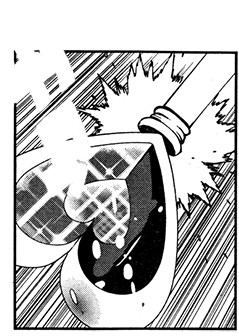
Redraw carefully. You do not have to be entirely faithful to the original raw on a redraw. Your goal is to fill in the empty space with something that appears correct. If you look closely I added in an extra starburst that the original didn't have. Don't redraw what is never seen. My example below breaks this rule, typeset your text and then redraw behind it. You don't have to redraw what your text covers.
Consistency
Font choice. Be consistent in your choice of fonts, nothing is more distracting than the font used for someone's speech changing constantly. A change in font can add some impact to a statement, but that is it, one statement, one sentence, one bubble, one scene. Otherwise consistency is key. I go as far as keeping the font for everyone's speech exactly the same. For minor impact I like to use bold, for major impact a different font.
What fonts do I use? That is a good question. I usually use the following.
| Font | Usage |
|---|---|
 | All main text and speech. I am not going to do any "nudge nudge, wink wink" on how to get this for free. |
 | With an uncanny resemblance to Wild Words, this font is useful for "messy text". |
 | Filling type holes in Wild Words, Titles, some SFX. |
 | I use this mostly for handwritten text. |
 | Used for Heavy or Violent Text or SFX. |
 | Used for Heavy or Violent Text or SFX. |
 | Used for text written on the side, asides and other small text. |
 | Used as an alternate for Kristen ITC, and when I need really small text. |
Keep in mind you are not restricted to using just these fonts, these are just the ones I have come across. Anything by Press Gang Studios (DaFont) is pretty good.
Page Size. You think this would be a given. But for many it is not. Always use the same page height and width. Unless you have a combined double page (double the width). Height is somewhat more forgivable to change than width is, so a variation of a dozen or two pixels most people will be okay with, page to page.
Quality. Yes that's right, be consistent in your quality. That is to say, in your cleaning and redrawing and font setting. It is very distracting to have a beautiful first few pages, and then garbage. If you don't want to keep up the pace of super high quality, lower your overall quality for the entire thing, so it is consistent. It might not be as glamorous as a full max quality release, but if you cannot keep it up for the entire Chapter/Manga, don't bother.
Correctness
Your work should stay true to the original.
Panel Guides. If you can, get your translators and proofreaders to use an easy-to-use format that tells you what panel and what text box what goes in. This will greatly reduce the number of accidently errors that occur when typesetting. Even if you are the translator, proofreader and editor. If you take any kind of rest between the them, you should write it down in an easy to read format.
| Bad! | Good! |
|---|---|
| Page 1. Hey look at that! Look at what? That! BZZZT~! Arrgh Page 2. Ouch, that hurt... BLAM BLAM! Are you okay? Uh, I think... Good! Get behind me! Why? Because the sky is falling! |
TLK = Speech Bubble/Box Page 1 Page 2 |